05.03.2010 20:00
Making of Health Potion
Making of Health Potion
Why icons in pixel graphisc and not in real 3D?
With an infinite inventory (as the one in RISEN), things quickly become confusing. Because up to a hundred items can treasure up there in the course of the game, it was important to allow quick and easy identification and keeping things clear.
In RGPs it's common to have many items of the same category (like bows and swords), so they must be very unique and distinct to prevent mistaking. A downscaled 3D model that shows the complete item causes such confusions. Often, one bow looks exactly like the other.
Hence, we decided to represent the items as 2D icons and put the focus on the individual characteristics. That can be a unique sword handle or the different colours of a potion. Additionally, each category was to be identified by a unique background colour. For example, tools have a grey background while plants have a green one.
The creation of an icon only 40x40 pixels in size is of course problematic. You don't have enough space to display all important information in a clearly visible way. And if an icon does not have any flashy properties it must at least be guaranteed that it can be identified by shape and colour.
The time I need to create an icon can vary strongly, too. For example, making the simple icon of the broom took almost as much time as the entire category of the rings. Things get really difficult with rather abstract icons. How do you paint a "joke", for example?
Basically, two workflows have been established in RISEN. Objects that already exist as 3D model are usually rendered with a simple lighting. This group mostly consists of weapons and armors. Other icons are drawn by hand. Looking are the icon of the small healing potion, you can see the first method very well:
1. First, you think about the basic shape of the potion bottles. As you can see on picture 1, they differ very much from each other and are also rendered from different perspectives. It's important not to put to many details into these models because they will get lost anyway due to the small target size of the icon.
2. The picture will be scaled to the size of the icon. Anything too large is clipped off.
3. Because we have many potions with different colours and shapes in RISEN, we can save some work and just change the colour of some bottles. This is done in a 2D program by changing the colour balance. Because the cork has to keep its colour, it's cut out before doing that.
4. Here you see the recoloured icon with the adapted cork. To emphasize the details and make elements stand out more plastically from the background, it's a good idea to insert different shadow layers.
5. To illustrate the reflection on the glass and to make the symbol stick out from the background even more, we insert a few light layers. Furthermore, you can see on this picture how the light edges are redrawn.
6. Now we add more details such as additional light layers and edges to make the glass look more plastically. It also causes the icon to "glow" a little. This shows that it is a bubbling potion.
7. At last, we cut the icon to size and put it in a border. Done.
Other examples:
8. Rum
Basically this is "just" a bottle but it needs additional details. Take the bottle label, for example. There's a tiny palm tree on it. Ideally, this little detail is combined with the shape and colour of the bottle and makes sure it can be found easily in the inventory.
9. Sneaking
This is one of the "abstract" icons. My first idea was to show some sneaking feet but that symbol was already planned to be used for sprinting. Therefore, I decided to use a "listening/lurking figure". I modelled it in a rough way and rendered it down just like the potions. The result is at least a unique icon to identify this skill.
10. Brewing potions
Finally, an example of a rather lavish icon made of many layers.
I hope you found this little Making-Of illuminating and liked it!
Best regards, André Thiel
Why icons in pixel graphisc and not in real 3D?
With an infinite inventory (as the one in RISEN), things quickly become confusing. Because up to a hundred items can treasure up there in the course of the game, it was important to allow quick and easy identification and keeping things clear.
In RGPs it's common to have many items of the same category (like bows and swords), so they must be very unique and distinct to prevent mistaking. A downscaled 3D model that shows the complete item causes such confusions. Often, one bow looks exactly like the other.
Hence, we decided to represent the items as 2D icons and put the focus on the individual characteristics. That can be a unique sword handle or the different colours of a potion. Additionally, each category was to be identified by a unique background colour. For example, tools have a grey background while plants have a green one.
The creation of an icon only 40x40 pixels in size is of course problematic. You don't have enough space to display all important information in a clearly visible way. And if an icon does not have any flashy properties it must at least be guaranteed that it can be identified by shape and colour.
The time I need to create an icon can vary strongly, too. For example, making the simple icon of the broom took almost as much time as the entire category of the rings. Things get really difficult with rather abstract icons. How do you paint a "joke", for example?
Basically, two workflows have been established in RISEN. Objects that already exist as 3D model are usually rendered with a simple lighting. This group mostly consists of weapons and armors. Other icons are drawn by hand. Looking are the icon of the small healing potion, you can see the first method very well:
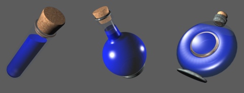
1. First, you think about the basic shape of the potion bottles. As you can see on picture 1, they differ very much from each other and are also rendered from different perspectives. It's important not to put to many details into these models because they will get lost anyway due to the small target size of the icon.

2. The picture will be scaled to the size of the icon. Anything too large is clipped off.

3. Because we have many potions with different colours and shapes in RISEN, we can save some work and just change the colour of some bottles. This is done in a 2D program by changing the colour balance. Because the cork has to keep its colour, it's cut out before doing that.

4. Here you see the recoloured icon with the adapted cork. To emphasize the details and make elements stand out more plastically from the background, it's a good idea to insert different shadow layers.

5. To illustrate the reflection on the glass and to make the symbol stick out from the background even more, we insert a few light layers. Furthermore, you can see on this picture how the light edges are redrawn.

6. Now we add more details such as additional light layers and edges to make the glass look more plastically. It also causes the icon to "glow" a little. This shows that it is a bubbling potion.

7. At last, we cut the icon to size and put it in a border. Done.
Other examples:

8. Rum
Basically this is "just" a bottle but it needs additional details. Take the bottle label, for example. There's a tiny palm tree on it. Ideally, this little detail is combined with the shape and colour of the bottle and makes sure it can be found easily in the inventory.

9. Sneaking
This is one of the "abstract" icons. My first idea was to show some sneaking feet but that symbol was already planned to be used for sprinting. Therefore, I decided to use a "listening/lurking figure". I modelled it in a rough way and rendered it down just like the potions. The result is at least a unique icon to identify this skill.

10. Brewing potions
Finally, an example of a rather lavish icon made of many layers.
I hope you found this little Making-Of illuminating and liked it!
Best regards, André Thiel


